 Multivariate Analysis of the Urban Heat Island of the Metropolitan Area of São Paulo, Brazil
Abstract
The Urban Heat Island (UHI) effect, where urban regions experience higher temperatures than their rural counterparts, is a well-observed phenomenon with consequences such as health issues and increased energy consumption. In the Metropolitan Area of São Paulo (MASP), a dense urban zone with over 20 million inhabitants, the UHI effect is intensified due to rapid and unplanned urbanization. This research utilized meteorological data from MASP's weather stations and employed the k-means clustering algorithm to identify regions with pronounced UHI intensity. The study revealed four distinct clusters, with Cluster A exhibiting the most significant UHI effect. This effect was related with land use patterns, particularly the dominance of residential and commercial areas and a lack of green spaces. Seasonal variations in the UHI effect were also observed. The findings highlight the impact of urban development on localized climate change and provide valuable insights for urban planning and policy-making in MASP. Future studies could expand on these findings by including more variables and examining other global urban regions.
Keywords
urban heat island; multivariate analysis; metropolitan area of São Paulo
Resumo
O efeito da Ilha de Calor Urbano (ICU), onde regiões urbanas experimentam temperaturas mais altas do que suas contrapartes rurais, é um fenômeno bem observado com consequências como problemas de saúde e aumento do consumo de energia. Na Região Metropolitana de São Paulo (RMSP), uma zona urbana densa com mais de 20 milhões de habitantes, o efeito ICU é intensificado devido à urbanização rápida e desordenada. Esta pesquisa utilizou dados meteorológicos das estações meteorológicas da RMSP e empregou o algoritmo de agrupamento k-means para identificar regiões com intensidade pronunciada de ICU. O estudo revelou quatro agrupamentos distintos, com o Grupo A exibindo o efeito ICU mais significativo. Esse efeito está associado com padrões de uso do solo, particularmente a predominância de áreas residenciais e comerciais e a falta de espaços verdes. Variações sazonais no efeito ICU também foram observadas. As descobertas destacam o impacto do desenvolvimento urbano nas mudanças climáticas localizadas e fornecem insights valiosos para o planejamento urbano e a formulação de políticas na RMSP. Estudos futuros poderiam expandir essas descobertas, incluindo mais variáveis e examinando outras regiões urbanas globais.
Palavras-chave
ilha de calor urbano; análise multivariada; região metropolitana de São Paulo
1. Introduction
The Urban Heat Island (UHI) is a phenomenon observed in cities worldwide, in which urban area temperatures are higher than those of the surrounding rural areas (Oke, 1982). This temperature difference is mainly attributed to urban densification, loss of green spaces, increased impervious surfaces, and heat release by buildings and vehicles (Santamouris, 2014). Higher urban temperatures bring a series of negative consequences, such as increased energy consumption, thermal discomfort, public health issues, and exacerbation of climate change (Akbari et al., 2009; Li et al., 2015).
The Metropolitan Area of São Paulo (MASP), one of the largest urban agglomerations in the world with an estimated population of over 20 million inhabitants, is grappling with the adverse effects of UHI due to intense and disorganized urbanization (De Lima et al., 2018). Situated in southeast Brazil, MASP is characterized by a humid subtropical climate and a history of rapid urbanization, providing an ideal environment for the intensification of the UHI phenomenon (Umezaki et al., 2020).
Therefore, this study aims to investigate the UHI in MASP, focusing on understanding the mechanisms contributing to this phenomenon and the effective strategies for its mitigation.
1.1. Objectives
The main objective of this article is to identify specific regions within the MASP that exhibit higher UHI intensity. Specifically, this study aims to conduct a temporal multivariate analysis of meteorological and land use data to identify urban areas in MASP with higher heat island intensities. Additionally, it was the objective of this study to understand the relationship between selected meteorological parameters and land use with UHI intensity.
2. Materials and Methods
The research outlined herein is designed to conduct a robust analysis of meteorological data collected from weather stations in the MASP. The methodology adopted encompasses the description of the data used, the pre-processing of these data, the application of the k-means clustering algorithm, and the subsequent analysis of the resulting clusters.
The first stage involves a detailed description of the meteorological data used in this study. The data are derived from various weather stations located in the MASP, monitored by the Emergencies Management Center (CGE) covering a range of parameters, including, air temperature, humidity, atmospheric pressure, wind speed, and precipitation. We chose this network of stations because they are the ones the municipality uses to monitor urban climate conditions in the MASP. The thorough discussion about data collection and nature sets the context for the processing and analysis steps that follow.
The pre-processing of the data represents a crucial stage in the applied methodology. Prior to any analysis, the data were subjected to a cleaning and normalization process, removing any inconsistencies and standardizing variables to a common scale. This step is vital for the effectiveness of the k-means clustering algorithm, which is sensitive to the scale and quality of the data.
Next, we used the k-means algorithm to cluster the meteorological data. K-means is a widely used clustering method that allows identifying patterns and trends in data through the creation of clusters of similar observations. In this context, k-means was applied to identify groups of weather stations with similar behaviors, based on selected variables.
Finally, a statistical analysis of the clusters formed by the k-means algorithm was done. This analysis involves interpreting the clusters, assessing their relevance, and identifying any significant patterns or trends. The purpose of this stage is to provide an in-depth understanding of MASP meteorological data and canopy urban heat island (CUHII) pattern, which can be used to inform future research and decision-making.
Through this carefully planned methodology, we aim to provide a deeper understanding of climatic patterns in the MASP, contributing to the existing literature and providing insights about it.
2.1. Database
The data used in the present work were obtained from thirty CGE meteorological stations from January 2009 to February 2019. Air temperature (°C), precipitation (mm) and relative humidity (%) values were used. The recorded data are 10 min averages of the sensor's measurements.

The graph shows the MASP, mapped with thirty different points, corresponding to the location of CGE meteorological stations.
We processed land use information from the database of Homogeneous Units of Urban Land Use and Occupation (UHCT) of the State of São Paulo (Secretaria do Meio Ambiente do Estado de São Paulo, 2021). UHCTs are the smallest geographic units used to analyze land use and land cover, and are derived from the association or blending of various landscape elements that establish specific spatial patterns. This method of analysis involves dividing or segmenting the territory into zones with similar characteristics in terms of certain physical attributes, as well as the form and texture inherent to the occupation. In this work, information on percentage of land occupation of residences, commerce and services and information on urban green areas were used.
2.2. Data preprocessing
Data from the 29 CGE urban meteorological stations in the MASP was collected and preprocessed (Fig. 1), including cleaning, hourly resampling, standardizing, and selecting relevant variables such as temperature, precipitation, and humidity. Land use data obtained through UHCT from São Paulo government state database was utilized, the weather station radius percentage land assumed had a radius of 0.5 km (Oke, 2006). For each variable the averages for the whole period were calculated for each CGE station.
Before applying k-means clustering, the data was standardized to ensure that all variables have the same scale and weight in the analysis process. The Standard Scaler was used to transform each variable by subtracting its mean and dividing by the standard deviation given the following equation (Jolliffe and Cadima, 2016):
where x represents data point; is the data mean; is the standard deviation.After standardization, Principal Component Analysis (PCA) was applied to reduce the dimensionality of the data, projecting it into a lower-dimensional space while preserving as much variance as possible (Abdi and Williams, 2010). PCA is a widely used statistical and machine learning technique for dimensionality reduction and multivariate data analysis. This technique was originally proposed by Karl Pearson in 1901 (Pearson, 1901) and later refined and popularized by Harold Hotelling in 1933 (Hotelling, 1933). PCA aims to transform a set of correlated variables into a new set of orthogonal variables called principal components. These principal components are linear combinations of the original variables and are ordered according to the amount of variance each of them explains (Joliffe and Cadima, 2016). The goal of PCA is to find a lower-dimensional subspace that best represents the structure of the data while preserving as much information as possible. In mathematical terms, this is done by decomposing the covariance matrix of the data using the eigen decomposition technique or singular value decomposition (SVD) (Abdi and Williams, 2010).
2.3. Clustering data
With the data standardized and reduced by PCA, the k-means algorithm was applied to perform clustering. The k-means algorithm is an unsupervised learning method that aims to partition a set of points into k distinct groups based on their similarity (Macqueen, 1967). In the case of CGE meteorological data, k-means was used to identify similar weather patterns among the stations, grouping them into clusters with common characteristics. This approach allows for a more detailed analysis of regional meteorological patterns and facilitates understanding of climatic interactions between the areas in the MASP.
The application of clustering methods for meteorological data was demonstrated in Silva et al. (2017), proving to be efficient in identifying climatic patterns and segmenting weather stations with similar characteristics. The use of clustering methods is a suitable tool for analyzing meteorological data, assisting in the identification of trends and weather forecasting.
Choosing the number of k clusters is a challenge in the k-means algorithm and is usually determined using techniques such as the elbow method, the silhouette method or cross-validation (Kodinariya and Makwana, 2013; Rousseeuw, 1987; Tibshirani et al., 2001). In the present study, the elbow method was used for this task. The elbow method is a heuristic approach employed to determine the optimal number of clusters (k) in a clustering algorithm, such as k-means. This method involves evaluating the Within-Cluster Sum of Squares (WCSS) as a function of different k values and selecting the “elbow” point in the resulting curve. The elbow point represents a balance between minimizing the WCSS and avoiding overfitting by not choosing an excessively large number of clusters (Kodinariya and Makwana, 2013). In this study, the elbow method identified the optimal number of clusters for the CGE dataset. To do this, k values ranging from 1 to 10 were tested and plotted the resulting WCSS against the number of clusters.
The mathematical function that describes WCSS minimization by finding k centroids in the k-means algorithm is given by the objective function J, which is defined as:
where n is the total number of points in the dataset; k is the number of clusters; xi is the ith point of the dataset; cj is the centroid of the jth cluster; is the squared Euclidean distance between the point xi and the centroid cj; wij is a binary variable that is 1 if point xi belongs to cluster j and 0 otherwise.2.4. Cluster data analysis
With data separated into clusters, the variation of the quartiles of the parameters considered to validate the composition of the clusters generated by the k-means algorithm were evaluated, CUHII was calculated for each cluster generated by the k-means algorithm and analyzed through hourly CUHII mean and Kernel Density Estimates (KDE) distribution, both by season, because the weather varies significantly from season to season in many locations around the world. This means that the intensity of the urban heat island can vary throughout the year. For example, CUHII can be more intense in summer due to increased solar radiation absorbed by built surfaces in urban areas (Oke, 1982).
Pearson's correlation was also calculated between pairs of variables in order to find correlation between them. Pearson's correlation, also known as Pearson's product-moment correlation coefficient or Pearson's r, is a measure of the correlation (linear dependence) between two continuous variables. It ranges from -1 to +1, where +1 indicates a strong positive correlation; 0 indicates no correlation; -1 indicates a strong negative correlation
Pearson's correlation is shown in the following equation:
where r is Pearson's correlation coefficient; and are the individual data points in the X and Y data sets; and are the means of X and Y; the sum σ goes from i = 1 up to n, where n is the number of data points.3. Results and Discussion
As expected, as the number of clusters increased in elbow method, the WCSS decreased. This is because when more clusters are added, each cluster becomes smaller and the distance between the points and their corresponding centroids is reduced. Upon examining the WCSS plot (Fig. 2), it was observed that the curve exhibited an “elbow” shape, indicating a point at which the rate of decrease in WCSS significantly slowed down. This elbow point occurred at k = 4, suggesting that partitioning the data into four clusters would provide the best balance between reducing the WCSS. Consequently, it was concluded that four clusters was the optimal number of clusters for our analysis.
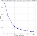
The figure shows how the elbow method provides a valuable approach to selecting the optimal number of clusters. Testing k values from 1 to 10 identified the elbow point in the WCSS plot, in this study were able to determine that four clusters were the most appropriate choice for CGE data.
The four clusters obtained demonstrate a clear separation between the data groupings (Fig. 3), suggesting that the k-means algorithm was effective in identifying the intrinsic differences among the observations. The formation of four distinct groups indicates that there are underlying patterns in the data that justify segmentation into four categories. Analyzing four clusters can reveal valuable insights about the shared characteristics of the observations within each group and the differences between the groups. Understanding these similarities and differences can aid in decision-making and devising specific strategies for each cluster, allowing for more targeted and effective approaches.

Graphical visualization of the clustering performed using the k-means algorithm, resulting in four distinct clusters. Each point on the plot represents an observation from the dataset, and the different colors indicate which cluster each observation belongs to. The larger “+” symbol represents the centroids of the respective clusters, which are the central points of each grouping.
The groupings obtained through the k-means algorithm can be viewed in the geographic space of MASP (Fig. 4).

The image depicts the MASP with 30 CGE weather stations, grouped into four clusters by the K-means algorithm. These clusters, marked by different colors, represent areas with similar weather patterns, providing a detailed and regionalized overview of the climate in RMSP.
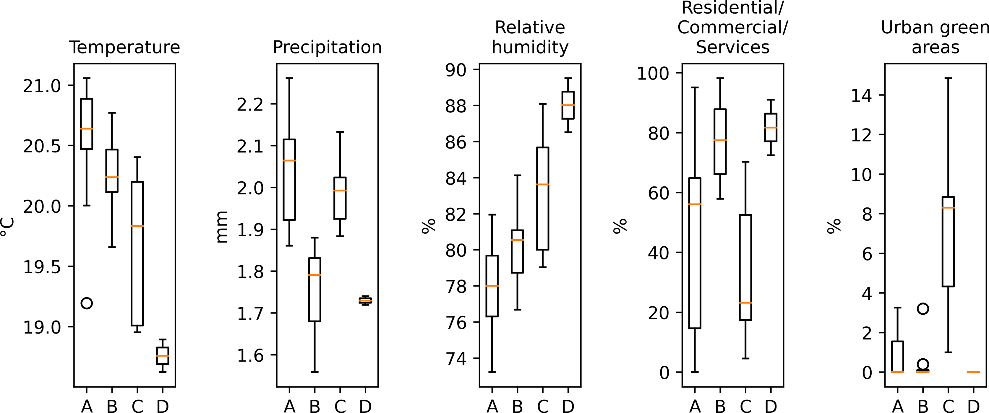
With data separated into clusters, it was possible to analyze the variation of variables by cluster through boxplots. The boxplots display the median (the horizontal line inside the box), the first quartile (the bottom edge of the box), and the third quartile (the top edge of the box) for each variable within each cluster. The whiskers extending from the boxes represent the range of the data, excluding potential outliers. Outliers are plotted individually as separate points beyond the whiskers.
By examining the subplots, it's possible to observe variations in the central tendency and dispersion of each variable across the three clusters. This information is useful in understanding how each cluster is characterized by the different variables and identifying specific features that distinguish one cluster from the others, in the present study this is evident mainly in the variables of temperature, humidity, precipitation and land use percentage variables like residential/commercial/services and urban green areas. Figure 5 provides a comprehensive visual representation of the distribution of each variable within the identified clusters, enabling a more in-depth understanding of the data patterns and informing subsequent analyses or decision-making processes.

Each subplot represents a specific variable across the four clusters identified by the k-means algorithm. Within each subplot, there are four boxplots, one for each cluster. The boxplots provide a clear visual comparison of the distribution of each variable across the clusters, allowing for the identification of patterns, similarities, and differences between the groups.
By analyzing the data referring to temperature, we can see that cluster A has the highest mean and temperature variability, while cluster D has the lowest mean and variability. Cluster C shows the greatest variability in temperature, with a standard deviation of 0.67, although the number of observations is smaller (Fig. 5).
As for precipitation, cluster A has the highest mean and variability, while cluster D has the lowest mean and variability. Cluster C has a relatively high variability compared to B and D, despite the reduced number of observations.
About relative humidity, cluster D has the highest mean and lowest variability, while cluster A has the lowest mean and greatest variability. Cluster C has the greatest variability, with a standard deviation of 3.8.
As for the average percentage of occupancy by residences/commerce/service variable, clusters B and D have averages greater than 75%, while clusters A and C have lower averages, with cluster A showing the greatest variability. Cluster B has relatively high variability, with a standard deviation of 14.8.
Regarding the average percentage of occupation by urban green areas, cluster C has the highest average and variability, while clusters A, B, and D have very low averages. Note that in cluster D there are no urban green areas, as the minimum, maximum and average values are all 0.
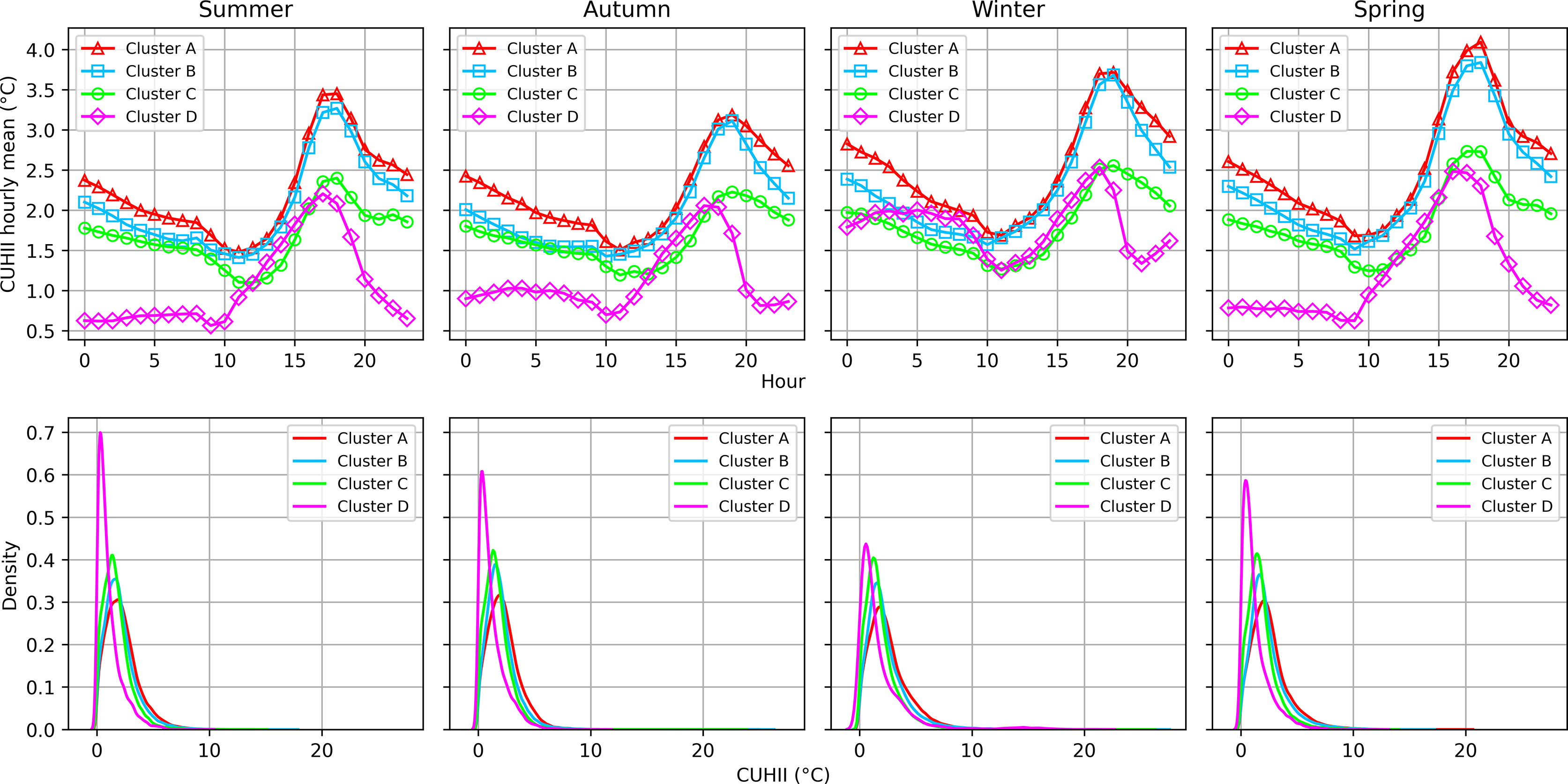
The following graph of CUHII between the clusters (Fig. 6) of CGE meteorological stations allows a better understanding of the phenomenon of interest in MASP and its relationship with meteorological parameters and patterns of land use.

The graphs are arranged in a 2 × 4 matrix, representing 2 rows and 4 columns. The first row of graphs depicts the hourly mean of UHII for each season (Summer, Autumn, Winter, and Spring) for each of the four clusters (A, B, C, and D), where the x-axis represents the hours of the day, while the y-axis represents the hourly UHII mean in degrees Celsius. The second row of graphs presents KDE of UHII for each season and cluster, KDE is a way of estimating the probability density function of a random variable, just like in the first row, each graph represents a different season where the x-axis now represents the UHII in degrees Celsius.
It is possible to notice from the previous graph that the hourly average of Cluster A exceeds the other clusters. In the continuous probability distribution graph, it is possible to notice that cluster A is more to the right than the other clusters, indicating that it has a greater probability of occurrence of more intense CHUII.
With the CHUII calculated for each cluster, it was possible to analyze the correlation between CHUII with meteorological and land use parameters. The correlation matrix charts below make it possible to visually check these correlations by season and cluster.

Correlation graph between CUHII (°C), temperature (°C), relative humidity (%), precipitation (mm), residential/ commercial/services (%) and urban green space (%) variables for the summer season per cluster generated by the k-means algorithm
In summer there is a strong positive correlation (Fig. 7) between CUHII and temperature (0.926327), relative humidity shows a strong negative correlation with CUHII and temperature (-0.643337 and -0.578449 respectively), which may indicate that conditions that days with CUHII and higher temperatures have an effect on reducing the relative humidity of the air.

Correlation graph between CUHII (°C), temperature (°C), relative humidity (%), precipitation (mm), residential/ commercial/services (%) and urban green space (%) variables for the autumn season per cluster generated by the k-means algorithm
In autumn (Fig. 8), similar to summer, CUHII and temperature remain strongly correlated (0.909487). Relative humidity still has a negative correlation with CUHII and temperature, but it is slightly lower in magnitude compared to summer.

Correlation graph between CUHII (°C), temperature (°C), relative humidity (%), precipitation (mm), residential/commercial/services (%) and urban green space (%) variables for the winter season per cluster generated by the k-means algorithm
In the winter season (Fig. 9) CUHII and temperature are still strongly correlated, although the correlation has decreased somewhat (0.890332). Relative humidity has a stronger negative correlation with CUHII and temperature (-0.702470 and -0.603821, respectively), which may be related to winter-specific factors.

Correlation graph between CUHII (°C), temperature (°C), relative humidity (%), precipitation (mm), residential/ commercial/services (%) and urban green space (%) variables for the spring season per cluster generated by the k-means algorithm
Finally in spring (Fig. 10) the correlation between CUHII and temperature is extremely strong (0.971410), suggesting that they are very closely linked in spring. Relative humidity shows a strong negative correlation with CUHII and temperature (-0.681134 and -0.641886, respectively). It is important to emphasize that the correlations here are just correlations and do not necessarily imply causality.
4. Conclusions
The implementation of the k-means algorithm to the meteorological data of MASP has demonstrated its efficacy in identifying specific areas with distinct climate patterns. The resulting four clusters highlight diverse climate and land use characteristics, further corroborating the UHI effect within the metropolitan region.
The findings reveal that Cluster A exhibited the most pronounced CUHII, with the highest mean and variability in temperature, and a strong relationship with land use patterns. It is evident that residential, commercial, and service land use, combined with relatively lower urban green area percentages, contribute to the CUHII effect, underlining the intricate connections between urban development and localized climate change.
Furthermore, the CUHII intensity varied by season, reflecting the dynamic and complex nature of climatic processes within MASP. The data analysis methods employed in this study, such as the hourly CUHII mean and Kernel Density Estimates (KDE) distribution, aided in elucidating these temporal patterns.
Overall, the application of k-means clustering and subsequent data analysis has offered valuable insights into the UHI phenomenon within MASP. It aids in understanding the relationship between urban land use patterns and climate change, crucial for urban planning and policy-making. The methodology and findings can be instrumental in devising climate mitigation strategies that consider the local context and specific climatic characteristics of urban regions.
However, it's worth noting that the study's scope is limited to a single metropolitan region over a particular time. For a more comprehensive understanding of the UHI effect, future research could incorporate additional factors like socio-economic data or utilize different clustering techniques. Furthermore, extending the study to other urban regions across the globe can provide comparative insights and contribute to the global discourse on urban climate change mitigation and adaptation.
Acknowledgments
We would like to extend our heartfelt gratitude to the CGE for generously providing access to data from their operational meteorological stations. This invaluable resource played a pivotal role in the formulation and success of this study. Their continued support and dedication to advancing scientific endeavors are deeply appreciated. We also recognize the efforts of the individuals at CGE who assisted in data retrieval and clarifications. Their expertise and willingness to collaborate have greatly enhanced the quality of our research.
Referências
- ABDI, H.; WILLIAMS, L.J. Principal Component Analysis Wiley Interdisciplinary Reviews: Computational Statistics, v. 2, n. 4, p. 433-459, 2010.
-
AKBARI, H.; POMERANTZ, M.; TAHA, H. Cool surfaces and shade trees to reduce energy use and improve air quality in urban areas. Solar Energy, v. 70, n. 3, p. 295-310, 2009. doi
» https://doi.org/10.1016/S0038-092X(00)00089-X -
DE LIMA, G.N.; RUEDA, V.O.M. The urban growth of the metropolitan area of Sao Paulo and its impact on the climate. Weather and Climate Extremes, v. 21, p. 17-26, 2018. doi
» https://doi.org/10.1016/j.wace.2018.05.002 -
JOLLIFFE, I.T.; CADIMA, J. Principal component analysis: a review and recent developments. Philosophical Transactions of the Royal Society A: Mathematical, Physical and Engineering Sciences, v. 374, n. 2065, 20150202, 2016. doi
» https://doi.org/10.1098/rsta.2015.0202 -
HOTELLING, H. Analysis of a complex of statistical variables into principal components. Journal of Educational Psychology, v. 24, n. 6, p. 417-441, 1933. doi
» https://doi.org/10.1037/h0071325 - KODINARIYA, T.M.; MAKWANA, P.R. Review on determining the number of cluster in K-means clustering. International Journal of Advance Research in Computer Science and Management Studies, v. 1, n. 6, p. 90-95, 2013.
-
LI, D.; BOU-ZEID, E.; OPPENHEIMER, M. The effectiveness of cool and green roofs as urban heat island mitigation strategies. Environmental Research Letters, v. 9, n. 5, 109082, 2015. doi
» https://doi.org/10.1016/j.buildenv.2022.109082 - MACQUEEN, J. Some methods for classification and analysis of multivariate observations. Proceedings of the 5th Berkeley Symposium on Mathematical Statistics and Probability, v. 1, p. 281-297, 1967.
-
OKE, T.R. The energetic basis of the urban heat island. Quarterly Journal of the Royal Meteorological Society, v. 108, n. 455, p. 1-24, 1982. doi
» https://doi.org/10.1002/qj.49710845502 - OKE, T.R. Initial Guidance to Obtain Representative Meteorological Observations at Urban Sites. Instruments and Observing Methods Report No. 81, WMO/TD-No. 1250 Vancouver: WMO, 2006.
-
PEARSON, K. LIII. On lines and planes of closest fit to systems of points in space. The London, Edinburgh, and Dublin Philosophical Magazine and Journal of Science, v. 2, n. 11, p. 559-572, 1901. doi
» https://doi.org/10.1080/14786440109462720 -
ROUSSEEUW, P.J. Silhouettes: a graphical aid to the interpretation and validation of cluster analysis. Journal of Computational and Applied Mathematics, v. 20, p. 53-65, 1987. doi
» https://doi.org/10.1016/0377-0427(87)90125-7 -
SANTAMOURIS, M. Cooling the cities – A review of reflective and green roof mitigation technologies to fight heat island and improve comfort in urban environments. Solar Energy, v. 103, p. 682-703, 2014. doi
» https://doi.org/10.1016/j.solener.2012.07.003 -
SECRETARIA DO MEIO AMBIENTE DO ESTADO DE SãO PAULO. Unidades Homogêneas de Uso e Ocupação do Solo Urbano do estado de São Paulo São Paulo: Secretaria do Meio Ambiente do Estado de São Paulo, 2021. Disponível em https://www.infraestruturameioambiente.sp.gov.br/cpla/cessao-de-dados/unidades-homogeneas-de-uso-e-ocupacao-do-solo-urbano-uhct/, acesso em 12 de setembro de 2023.
» https://www.infraestruturameioambiente.sp.gov.br/cpla/cessao-de-dados/unidades-homogeneas-de-uso-e-ocupacao-do-solo-urbano-uhct/ -
SILVA, F.B.; LONGO, K.M.; DE ANDRADE, F.M. Spatial and temporal variability patterns of the urban heat island in São Paulo. Environments, v. 4, n. 2, 27, 2017. doi
» https://doi.org/10.3390/environments4020027 -
TIBSHIRANI, R.; WALTHER, G.; HASTIE, T. Estimating the number of clusters in a data set via the gap statistic. Journal of the Royal Statistical Society: Series B (Statistical Methodology), v. 63, n. 2, p. 411-423, 2001. doi
» https://doi.org/10.1111/1467-9868.00293 -
UMEZAKI, A.S.; RIBEIRO, F.N.D.; OLIVEIRA, A.P.; SOARES, J. Numerical characterization of spatial and temporal evolution of summer urban heat island intensity in São Paulo, Brazil. Urban Climate, v. 32, 100615, 2020. doi
» https://doi.org/10.1016/j.uclim.2020.100615